


Somewhat Bold font
Publisher
MyFonts.com
License
$ Commercial
Date added
Nov 28 2016
A tall, narrow font with a playful and consistent style.
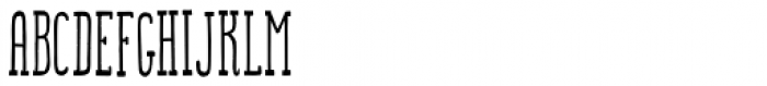
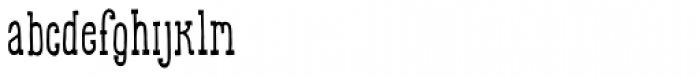
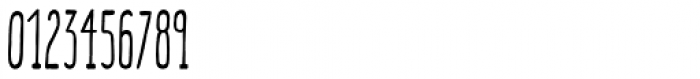
This font features tall, narrow letters with a slightly playful and quirky style. The characters have a uniform stroke width, giving them a clean and consistent appearance. The uppercase letters are particularly elongated, while the lowercase letters maintain a similar height, creating a cohesive look. The numerals and special characters follow the same design principles, ensuring a harmonious overall aesthetic.
Ideal for posters, headlines, and branding projects that require a distinctive and eye-catching typeface.
Headlines, Logos
Balanced
Download Somewhat Bold font.
Ideal for posters, headlines, and branding projects that require a distinctive and eye-catching typeface.
Headlines, Logos
Balanced
See the font with your own custom text

Category
Decorative/Display
Bold
No
Italic
No
Weight
Regular
Width
Condensed
Character spacing
Normal
Line height
Tall
Contrast
Low
Overall style
Modern
X height
Medium
Cap height
High
Proposed projects
Ideal for posters, headlines, and branding projects that require a distinctive and eye-catching typeface.
Use case
Headlines, Logos
Ascender descender ratio
Balanced
Similar Free Fonts for Somewhat Bold
Dense-Regular Font


$ Free > Personal Use
LT Amber Compressed Font

$ Free > Personal Use
Similar fonts for Somewhat Bold from Adobe.com
Alternate Gothic Compressed ATF Book Font

$ Commercial > Adobe.com
Alternate Gothic Compressed ATF Regular Font

$ Commercial > Adobe.com
Similar fonts for Somewhat Bold from MyFonts.com
Somewhat Bold Font
$ Commercial > MyFonts.com
Somewhat Font

$ Commercial > MyFonts.com
Similar fonts for Somewhat Bold from CreativeMarket.com
Noelles Condensed otf (400) Font

$ Commercial > CreativeMarket.com
Luna Stylish otf (400) Font

$ Commercial > CreativeMarket.com


Help your fellow font-seekers if you think you can recognize the font. Earn some good karma by doing it :-) Answer & Help
Yet sometimes the images are very complex, so other users need a bit of help.
If you recognize the font from the samples posted here don't be shy and help a fellow designer.
Thousands of designers (famous or not) use the image font detection system to find a font or similar free fonts from an image. Although we have the largest database of fonts, the search for a font from an image gets mixed results like the image above.