Pourquoi font
Publisher
License
$ Free for personal use
Date added
Jan 12 2017
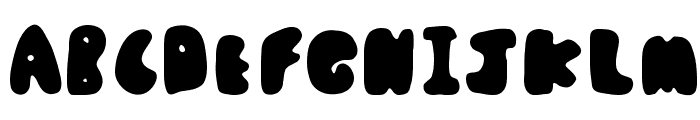
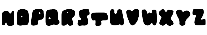
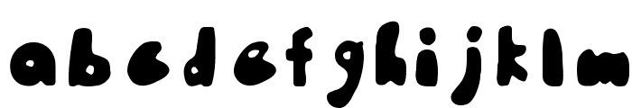
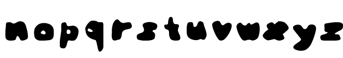
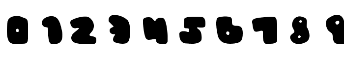
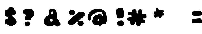
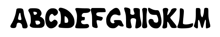
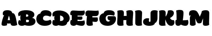
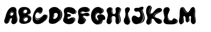
A bold, playful font with rounded, irregular shapes.
This playful and bold font features rounded, irregular shapes with a whimsical and informal style. The characters are thick and have a bubbly appearance, making them stand out with a unique personality.
Ideal for children's books, playful branding, comic strips, and creative posters.
Headlines, Logos, Posters
Balanced
Download Pourquoi font. Pourquoi by Cherith Walsh. Free to use, however please reference me and include a link back to where you obtained.
Ideal for children's books, playful branding, comic strips, and creative posters.
Headlines, Logos, Posters
Balanced
(www.cherithwalsh.com)
See the font with your own custom text

Category
Decorative/Display
Bold
Yes
Italic
No
Weight
Bold
Width
Normal
Character spacing
Normal
Line height
Normal
Contrast
Low
Overall style
Playful
X height
Medium
Cap height
High
Proposed projects
Ideal for children's books, playful branding, comic strips, and creative posters.
Use case
Headlines, Logos, Posters
Ascender descender ratio
Balanced
Similar Free Fonts for Pourquoi
Pourquoi Font

$ Free > Personal Use
TheShyFamilyfont Font
$ Free > Personal Use
Similar fonts for Pourquoi from Adobe.com
HelloFont ID LongFeiShouShu Regular Font

$ Commercial > Adobe.com
Manteiga Gorda Font
$ Commercial > Adobe.com
Similar fonts for Pourquoi from MyFonts.com
Knicknack Fuzzy Heavy Font

$ Commercial > MyFonts.com
Cooraline Shadow Font
$ Commercial > MyFonts.com
Similar fonts for Pourquoi from CreativeMarket.com
RealCool-Regular otf (400) Font

$ Commercial > CreativeMarket.com
Cooraline Regular otf (400) Font

$ Commercial > CreativeMarket.com

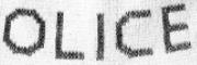
Help your fellow font-seekers if you think you can recognize the font. Earn some good karma by doing it :-) Answer & Help
Yet sometimes the images are very complex, so other users need a bit of help.
If you recognize the font from the samples posted here don't be shy and help a fellow designer.
Thousands of designers (famous or not) use the image font detection system to find a font or similar free fonts from an image. Although we have the largest database of fonts, the search for a font from an image gets mixed results like the image above.