
OpenDyslexicAlta font
Publisher
License
$ Free for personal use
Date added
Nov 11 2018
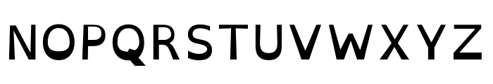
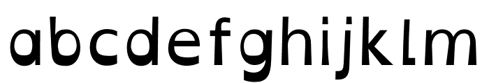
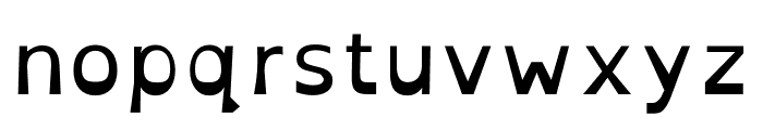
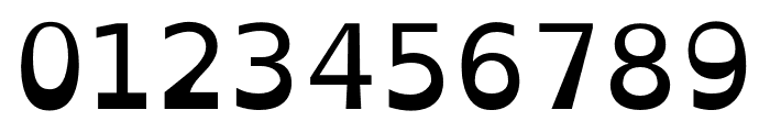
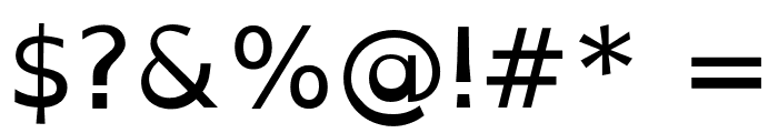
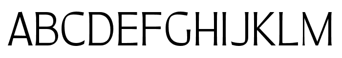
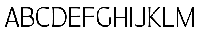
A readability-focused font with a heavier bottom for improved clarity.
This font features a unique design aimed at improving readability, particularly for individuals with dyslexia. The characters have a heavier bottom, which helps prevent them from being flipped or confused. The style is clean and straightforward, with a focus on clarity.
Ideal for educational materials, accessibility-focused designs, and user interfaces requiring high readability.
Body text, Educational materials, Accessibility tools
Balanced
Download OpenDyslexicAlta font. OpenDyslexicAlta by Original Fonts are © Bitstream. OpenDyslexic changes and additional glyphs by Abelardo Gonzalez are licensed under a Creative Commons Attribution 3.0 Unported License.
Based on a work at http://dyslexicfonts.com. _2012 by Abe
Ideal for educational materials, accessibility-focused designs, and user interfaces requiring high readability.
Body text, Educational materials, Accessibility tools
Balanced
(Abelardo Gonzalez - abbiecod.es)
See the font with your own custom text

Category
Sans-Serif
Bold
No
Italic
No
Weight
Regular
Width
Normal
Character spacing
Normal
Line height
Normal
Contrast
Low
Overall style
Modern
X height
Medium
Cap height
High
Proposed projects
Ideal for educational materials, accessibility-focused designs, and user interfaces requiring high readability.
Use case
Body text, Educational materials, Accessibility tools
Ascender descender ratio
Balanced
Similar Free Fonts for OpenDyslexicAlta
OpenDyslexic Font


$ Free > Personal Use
OpenDyslexicAlta Font
$ Free > Personal Use
Similar fonts for OpenDyslexicAlta from Adobe.com
Quiverleaf CF Extra Bold Font
$ Commercial > Adobe.com
Quiverleaf Arabic CF Extra Bold Font
$ Commercial > Adobe.com
Similar fonts for OpenDyslexicAlta from MyFonts.com
Tric Regular Font

$ Commercial > MyFonts.com
Kaeswaii Extra Medium Font

$ Commercial > MyFonts.com
Similar fonts for OpenDyslexicAlta from CreativeMarket.com
Fruits Delight otf (300) Font

$ Commercial > CreativeMarket.com
Tric otf (400) Font

$ Commercial > CreativeMarket.com


Help your fellow font-seekers if you think you can recognize the font. Earn some good karma by doing it :-) Answer & Help
Yet sometimes the images are very complex, so other users need a bit of help.
If you recognize the font from the samples posted here don't be shy and help a fellow designer.
Thousands of designers (famous or not) use the image font detection system to find a font or similar free fonts from an image. Although we have the largest database of fonts, the search for a font from an image gets mixed results like the image above.