
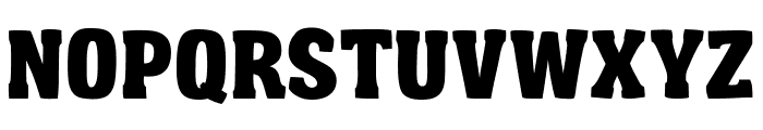
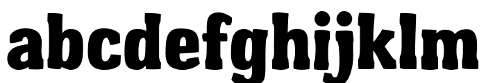
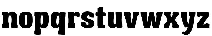
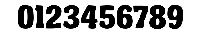
Garishing Worse font
Publisher
License
$ Free for personal use
Date added
Dec 02 2023
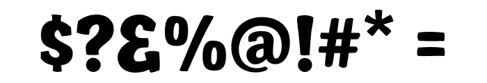
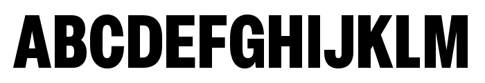
A bold, playful font with thick strokes and rounded edges.
This font features bold, thick strokes with a playful and slightly irregular design. The characters have a strong presence, making it suitable for attention-grabbing headlines. The rounded edges and slight variations in stroke width give it a friendly and approachable feel.
Ideal for posters, headlines, children's books, and playful branding.
Headlines, Logos
Balanced
Download Garishing Worse font. Garishing Worse by Copyright (c) 2011 by The Fontry. All rights reserved.
Ideal for posters, headlines, children's books, and playful branding.
Headlines, Logos
Balanced
See the font with your own custom text

Category
Decorative/Display
Bold
Yes
Italic
No
Weight
Bold
Width
Normal
Character spacing
Normal
Line height
Normal
Contrast
Medium
Overall style
Playful
X height
Medium
Cap height
High
Proposed projects
Ideal for posters, headlines, children's books, and playful branding.
Use case
Headlines, Logos
Ascender descender ratio
Balanced
Similar Free Fonts for Garishing Worse
Garishing Worse Font

$ Free > Personal Use
Garishing Worse Font

$ Free > Personal Use
Similar fonts for Garishing Worse from Adobe.com
Elza Condensed Black Font
$ Commercial > Adobe.com
Brown Pro Extra Bold Condensed Font

$ Commercial > Adobe.com
Similar fonts for Garishing Worse from MyFonts.com
FTY Garishing Worse Font

$ Commercial > MyFonts.com
Brown Pro ExtraBold Font

$ Commercial > MyFonts.com
Similar fonts for Garishing Worse from CreativeMarket.com
Moblick Bold otf (700) Font

$ Commercial > CreativeMarket.com
Molde SemiCondensed-Black otf (900) Font

$ Commercial > CreativeMarket.com


Help your fellow font-seekers if you think you can recognize the font. Earn some good karma by doing it :-) Answer & Help
Yet sometimes the images are very complex, so other users need a bit of help.
If you recognize the font from the samples posted here don't be shy and help a fellow designer.
Thousands of designers (famous or not) use the image font detection system to find a font or similar free fonts from an image. Although we have the largest database of fonts, the search for a font from an image gets mixed results like the image above.