


Game Continue 02 font
Publisher
License
$ Free for personal use
Date added
Mar 26 2017
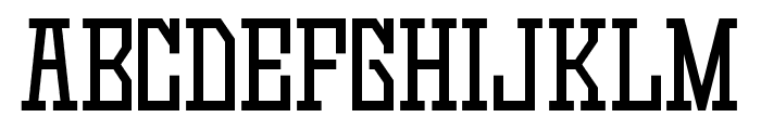
Bold, blocky font with prominent serifs and a strong presence.
This font features bold, blocky characters with a strong presence. The letters have a uniform width and a slightly condensed appearance, giving them a robust and impactful look. The serifs are prominent and squared, adding to the font's boldness. The numbers and special characters maintain the same strong, structured style.
Ideal for sports team logos, posters, and headlines that require a bold statement.
Headlines, Logos
Balanced
Download Game Continue 02 font. Game Continue 02 by Goma Shin
Ideal for sports team logos, posters, and headlines that require a bold statement.
Headlines, Logos
Balanced
(Fonts by Goma Shin - www.geocities.jp/gomarice_font/ - Personal-use only. For commercial use please contact owner.)
See the font with your own custom text

Category
Slab Serif
Bold
Yes
Italic
No
Weight
Bold
Width
Condensed
Character spacing
Normal
Line height
Normal
Contrast
Low
Overall style
Decorative
X height
Medium
Cap height
High
Proposed projects
Ideal for sports team logos, posters, and headlines that require a bold statement.
Use case
Headlines, Logos
Ascender descender ratio
Balanced
Similar Free Fonts for Game Continue 02
Game Continue 02 Font

$ Free > Personal Use
Game Continue 03 Font
$ Free > Personal Use
Similar fonts for Game Continue 02 from Adobe.com
Mesquite Std Medium Font

$ Commercial > Adobe.com
Charcuterie Flared Bold Font

$ Commercial > Adobe.com
Similar fonts for Game Continue 02 from MyFonts.com
Player Condensed Bold Font

$ Commercial > MyFonts.com
Winner Compressed Medium Font

$ Commercial > MyFonts.com
Similar fonts for Game Continue 02 from CreativeMarket.com
Shoreline Bold otf (700) Font

$ Commercial > CreativeMarket.com
Rita Medium otf (500) Font

$ Commercial > CreativeMarket.com


Help your fellow font-seekers if you think you can recognize the font. Earn some good karma by doing it :-) Answer & Help
Yet sometimes the images are very complex, so other users need a bit of help.
If you recognize the font from the samples posted here don't be shy and help a fellow designer.
Thousands of designers (famous or not) use the image font detection system to find a font or similar free fonts from an image. Although we have the largest database of fonts, the search for a font from an image gets mixed results like the image above.